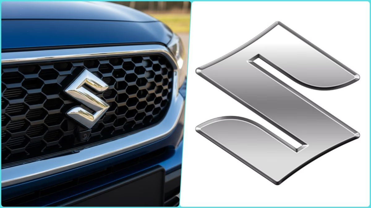
Suzuki New Logo:
In the automobile world, a brand's identity is as much about its emblem as it is about its vehicle design. That’s why when a company changes its logo, it’s not just a 'design upgrade,' but a declaration of its future vision and path. Following this trend, the Japanese automotive giant Suzuki Motor Corporation has reimagined its vehicle emblem after 22 long years.
The three-dimensional emblem, used since the launch of the third-generation Wagon R in 2003, is now set to become history. The new emblem has been crafted with a flat design, making it easily recognizable even on smaller screens like smartphones. High-brightness silver paint replaces the conventional chrome plating. Though, at a glance, the new and old logo designs do not drastically differ.
The company has clarified that this new emblem will be first seen on concept models displayed at the Japan Mobility Show. Gradually, it will be applied to all production models. It is noteworthy that the Japan Mobility Show is set to commence on October 30, attracting automobile manufacturers from around the globe.

Source: aajtak
Suzuki Motor Corporation’s President, Toshihiro Suzuki, stated, “The new emblem (logo) symbolizes our readiness to embrace future challenges.” The company’s new corporate slogan is “By Your Side.” Suzuki asserts that through this slogan, it aims to stand shoulder to shoulder with its customers.
Over the past few years, there has been a visible shift in the automotive world. Car brands are letting go of their traditional, hefty three-dimensional logos in favor of sleek, minimalist designs. Hence, Suzuki's new emblem aspires to be part of this global trend.
It’s worth recalling that in April of this year, the company also revamped its corporate logo after 39 years. The lines in the word “SUZUKI” were made slimmer, and the gaps widened for clarity and appeal, even on small screens. Essentially, Suzuki is adapting not just its car designs but also its identity to meet the evolving demands of the digital world.
Following the global debut of the new logo, Suzuki will implement it across its entire model range. Since no changes were made to the logo’s proportions, it can easily be affixed to the grills and tailgates of existing models, eliminating the wait for new product launches. In India, the company might first use it in the newly launched Victoris SUV.


